Not that much detailed, but you can create some simple but adjustable abstract background with solid and gradient layers in Photoshop. In this part of the coloring tutorial, I am going to demonstrate how a matching background for our compostion can be created within a few minutes witout much efforts.
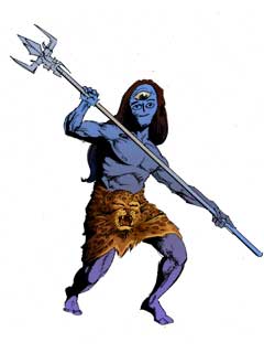
When both the skin layer and the mahadeva layer is turned on, we can see this, But something is missing... we need a perfect background so that our god stands out.
I wanted the background to be a semi realistic one. There should be some hint of a prehistoric land and a cloudy sky only. No perfect presentation, but the message should be salient.

I started by adding a simple linear gradient under bg set. Its settings is like this.
Since there will be no perfect demarcation between the sky and the land and as the whole environment will be kind of fogy, so I blended the tint of sky into the land and added just one more tint for the far horizon.
See that the angle of the gradient is not 90 degree as expected for the 'horizon'. It is because I don't want to show the horizon between the sky and the land and I wanted it be rather defused.

I took another new document with a solid background, and clicked filter → Render → Difference cloud
Then I pressed command+f / ctrl+f a few times so that can choose from more variations of the cloud pattern.
When I am satisfied with the shape and pattern of the image, I adjusted the brightness and contrast of the image to get a more sharp color difference and using eraser tool I erased some parts on the top and the bottom of that image.
After stretching horizontally by pressing command+t / ctrl+t, the result is somewhat like this.

This image will be used as both the cloud and the land.
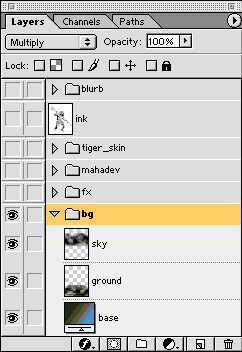
Now the image is copied and pasted inside the bg set of our main image.
I made another copy of the image pressing command+j / ctrl+j. I renamed the first layer as sky and place it according to a arbitrary location, again I renamed the second layer as ground and distorted and cropped and placed it accordingly.
I also applied some blur effect to the portions of the land which are in distance.

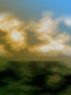
Here is the result.

Then I set the blend mode of the cloud layer to screen and the blend mode of the ground layer to multiply.

Gradient map adjustment setting for the sky
After adjusting the gradient map, that is clicking image → adjust → gradient map... and adding some intermediate color to the black and white gradient the image looks like this.

Gradient map adjustment setting for the sky

Turning on the other layers I took reference for placing a cast shadow on the ground and so inserted a new layer over ground. And using pen tool draw the areas where shadow will cast and converting the paths to selection I made some gradient to simulate shadow. Later the blend mode of the layer were set to multiply.
After all these efforts the results is this.
As I had told you earlier, the overall environment is kind of foggy and looks like there is a war going on behind the scene.
You might revise the previous part of this series Painting the drappery or read forth about
Adding effects to our composition
Part 1 : Creating a workspace
Part 2: Coloring the character
Part 3 : Coloring accessories
Part 4 : Adding shadows and highlights
Part 5 : Painting the drappery
Part 6: Creating a background
Part 7 : Adding effects
Part 8 : Creating the blurb
When both the skin layer and the mahadeva layer is turned on, we can see this, But something is missing... we need a perfect background so that our god stands out.
I wanted the background to be a semi realistic one. There should be some hint of a prehistoric land and a cloudy sky only. No perfect presentation, but the message should be salient.
I started by adding a simple linear gradient under bg set. Its settings is like this.
Since there will be no perfect demarcation between the sky and the land and as the whole environment will be kind of fogy, so I blended the tint of sky into the land and added just one more tint for the far horizon.
See that the angle of the gradient is not 90 degree as expected for the 'horizon'. It is because I don't want to show the horizon between the sky and the land and I wanted it be rather defused.
I took another new document with a solid background, and clicked filter → Render → Difference cloud
Then I pressed command+f / ctrl+f a few times so that can choose from more variations of the cloud pattern.
When I am satisfied with the shape and pattern of the image, I adjusted the brightness and contrast of the image to get a more sharp color difference and using eraser tool I erased some parts on the top and the bottom of that image.
After stretching horizontally by pressing command+t / ctrl+t, the result is somewhat like this.
This image will be used as both the cloud and the land.
Now the image is copied and pasted inside the bg set of our main image.
I made another copy of the image pressing command+j / ctrl+j. I renamed the first layer as sky and place it according to a arbitrary location, again I renamed the second layer as ground and distorted and cropped and placed it accordingly.
I also applied some blur effect to the portions of the land which are in distance.
Here is the result.
Then I set the blend mode of the cloud layer to screen and the blend mode of the ground layer to multiply.
Gradient map adjustment setting for the sky
After adjusting the gradient map, that is clicking image → adjust → gradient map... and adding some intermediate color to the black and white gradient the image looks like this.
Gradient map adjustment setting for the sky
Turning on the other layers I took reference for placing a cast shadow on the ground and so inserted a new layer over ground. And using pen tool draw the areas where shadow will cast and converting the paths to selection I made some gradient to simulate shadow. Later the blend mode of the layer were set to multiply.
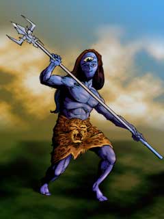
After all these efforts the results is this.
As I had told you earlier, the overall environment is kind of foggy and looks like there is a war going on behind the scene.
You might revise the previous part of this series Painting the drappery or read forth about
Adding effects to our composition
Comments
Post a Comment