A short but useful tutorial about converting simple pencil sketch to finished black and white line art in Photoshop. I have written this tutorial some years ago for my former site, and later when I started scorpydesign, I thought about sharing it here too for interested designers or comic book artist/colorists.
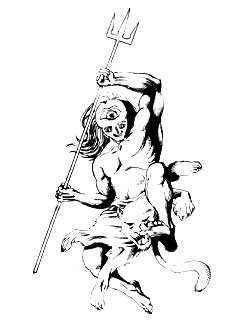
Originally the image shown here was made on a scrap newsprint exercise book page. I made the drawing first using a 2b pencil and then finalised it with a ball-point pen. The refill of the ball-point pen was blue, but as I am going to made the whole drawing 'desaturated', so outline color is not a factor to bother about.
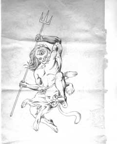
When I first scanned the image it looks like this in Photoshop. I use an Umax Astra scanner in my office. Actually I don't have any scanner, that's why I always have to depend on my office hardware for this purpose. The bed size of the scanner is a3, so I generally set it at the a4 position as I always use exercise book pages / scrap paper / Xerox waste from my office etc. and the dimension of the papers never exceeds a4.
The first scan is here and it’s in 300 dpi, so that after reducing the size the lines will be much sharp and crisp.
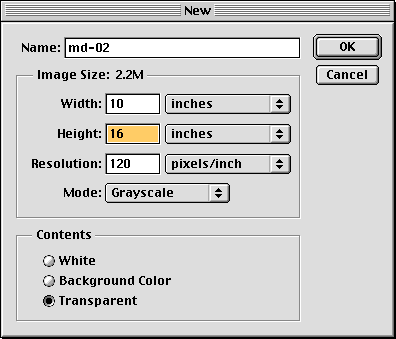
now I have pressed command+n / ctrl+n to bring the new image dialog box and set the parameter as shown. Here see that the contents is set to 'transparent' as when I will paste the scanned image here in the new document no background or other additional layers will be there. We will end up with a single layer.
Also see that the color mode of the new image is set to grayscale, as, in our inking process there should be no other tints rather than black and white.
now I just selected the whole scanned image and pressing command+a / ctrl+a copied it pressing command+c / ctrl+c and pasted it inside the new image.
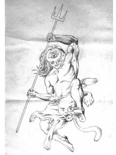
After some scaling / cropping and adjusting placement, the composition on the page is like this. Now it’s time for elimination of the paper 'grey' which is obvious for the newsprints.
Moreover here are two problems also
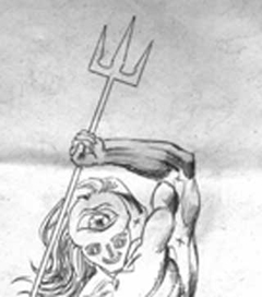
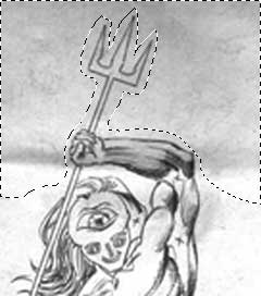
you can see that this area is a mess - all kinds of troubles have been cluttered here on this spot. Firstly the newsprint grey, secondly a shade for folding thirdly the background impressions all these factors are present here.
Lets first select the unnecessary area using lasso tool...

...and then just simply press command+delete / ctrl+Del to fill the area with background color.
Please keep in mind that I always reset my foreground and background color to black & white pressing d before starting nay new project. Doing so ensures me that I am drawing with 'black' and erasing with 'white'. Avoid erasing the parts of the image by pressing only delete / del. because, we don’t need alpha as we are going to put this layer at top of the color layers
And will set its blend mode to 'multiply' so why messing up with the additional alpha data?
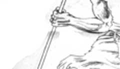
same thing goes for the areas near the right hand holding the trident.
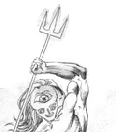
Now that all the unnecessary parts of our image is erased, here is the first cleaned up version. Notice that the left hand is looking darker as we had not deleted the grey from inside the ink boundary.
I could not take risk of destroying the original lines in this phase.
Again we will make our lines properly black and paper - proper 'white by adjusting brightness / contrast and we may adjust curves a little, but applying the adjustments all over the image may keep this are as black as possible and hence it will disturb the whole image.
So I have selected the hand using lasso tool and applied a slight feather to the selection
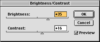
then I open brightness contrast adjustment dialog by going to image > adjust > Brightness/Contrast and adjusted its values turning preview 'on'. I have to make the gain of the selection same as of the rest of the image.
Always keep in mind that while adjusting your image for perfect black and white as in the comics book inking, don’t decrease 'brightness'. Rather first increase brightness to clamp away grey and then increase contrast to restore black.
And when the preview is satisfactory, I pressed ok to keep the result.
Now that the gain of the whole image is uniform, that is, the darkness of black and brightness of white is same everywhere, we can proceed for our final adjustments.
Lets again play with the brightness / contrast. Pump up the brightness level until all the greys are vanished, then increase contrast so that some greys are converted into black, then again decrease brightness level to maintain a balance between black and white and finally increase the contrast level some more to make the outlines solid.
It’s not that difficult as it is written

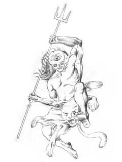
here is the output.
While adjusting the brightness contrast levels keep the image to 100% zoom, so that you can have an overview of the whole image. Again it is very important to retain the outlines of the image, otherwise the sense of perfect inking style as we see in the comics books, will be disturbed. While adjusting brightness/contrast you can zoom into the image to see what’s happening there inside various complex parts. But don’t zoom in or out to a fraction of percentage, always stick to a percentage which is a power of 100, that is 12.5, 25, 50, 100, 200, 400 etc.
The logic behind this is bicubic algorithm. Here at these different zoom levels the pixels are represented as 1/8, 1/4, 1/2, 1, 2, 4 etc. hence you will have the perfect pixel representations by the time of processing.
Now it is the easiest part of the project. Just locate the X marks on the image and fill the surrounding with black. I am very much comfortable with pen tool, but polygonal lasso tool is also fine. Anyhow select the area surrounding the X marks and press option+delete/ alt+del to fill it with foreground. Inking of the pencil is complete.
However, if you find that the adjusted black is different from the pallet black you can adjust brightness/contrast again, to achieve a perfect balance. This inking process is done completely in grayscale mode, when it will be converted to cmyk, the black level may change. There you will have to do additional corrections too.
That will be another tutorial.
Originally the image shown here was made on a scrap newsprint exercise book page. I made the drawing first using a 2b pencil and then finalised it with a ball-point pen. The refill of the ball-point pen was blue, but as I am going to made the whole drawing 'desaturated', so outline color is not a factor to bother about.
When I first scanned the image it looks like this in Photoshop. I use an Umax Astra scanner in my office. Actually I don't have any scanner, that's why I always have to depend on my office hardware for this purpose. The bed size of the scanner is a3, so I generally set it at the a4 position as I always use exercise book pages / scrap paper / Xerox waste from my office etc. and the dimension of the papers never exceeds a4.
The first scan is here and it’s in 300 dpi, so that after reducing the size the lines will be much sharp and crisp.
now I have pressed command+n / ctrl+n to bring the new image dialog box and set the parameter as shown. Here see that the contents is set to 'transparent' as when I will paste the scanned image here in the new document no background or other additional layers will be there. We will end up with a single layer.
Also see that the color mode of the new image is set to grayscale, as, in our inking process there should be no other tints rather than black and white.
now I just selected the whole scanned image and pressing command+a / ctrl+a copied it pressing command+c / ctrl+c and pasted it inside the new image.
After some scaling / cropping and adjusting placement, the composition on the page is like this. Now it’s time for elimination of the paper 'grey' which is obvious for the newsprints.
Moreover here are two problems also
- Firstly the on the back of the paper I have scribbled using either pencil or ball-point pen, so here on the front side there is some impressions of them
- And secondly, since I had folded the paper to carry it to my office, there are some additional shades too. I need to get rid of these.
you can see that this area is a mess - all kinds of troubles have been cluttered here on this spot. Firstly the newsprint grey, secondly a shade for folding thirdly the background impressions all these factors are present here.
Lets first select the unnecessary area using lasso tool...
...and then just simply press command+delete / ctrl+Del to fill the area with background color.
Please keep in mind that I always reset my foreground and background color to black & white pressing d before starting nay new project. Doing so ensures me that I am drawing with 'black' and erasing with 'white'. Avoid erasing the parts of the image by pressing only delete / del. because, we don’t need alpha as we are going to put this layer at top of the color layers
And will set its blend mode to 'multiply' so why messing up with the additional alpha data?
same thing goes for the areas near the right hand holding the trident.
Now that all the unnecessary parts of our image is erased, here is the first cleaned up version. Notice that the left hand is looking darker as we had not deleted the grey from inside the ink boundary.
I could not take risk of destroying the original lines in this phase.
Again we will make our lines properly black and paper - proper 'white by adjusting brightness / contrast and we may adjust curves a little, but applying the adjustments all over the image may keep this are as black as possible and hence it will disturb the whole image.
So I have selected the hand using lasso tool and applied a slight feather to the selection
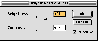
then I open brightness contrast adjustment dialog by going to image > adjust > Brightness/Contrast and adjusted its values turning preview 'on'. I have to make the gain of the selection same as of the rest of the image.
Always keep in mind that while adjusting your image for perfect black and white as in the comics book inking, don’t decrease 'brightness'. Rather first increase brightness to clamp away grey and then increase contrast to restore black.
And when the preview is satisfactory, I pressed ok to keep the result.
Now that the gain of the whole image is uniform, that is, the darkness of black and brightness of white is same everywhere, we can proceed for our final adjustments.
Lets again play with the brightness / contrast. Pump up the brightness level until all the greys are vanished, then increase contrast so that some greys are converted into black, then again decrease brightness level to maintain a balance between black and white and finally increase the contrast level some more to make the outlines solid.
It’s not that difficult as it is written
here is the output.
While adjusting the brightness contrast levels keep the image to 100% zoom, so that you can have an overview of the whole image. Again it is very important to retain the outlines of the image, otherwise the sense of perfect inking style as we see in the comics books, will be disturbed. While adjusting brightness/contrast you can zoom into the image to see what’s happening there inside various complex parts. But don’t zoom in or out to a fraction of percentage, always stick to a percentage which is a power of 100, that is 12.5, 25, 50, 100, 200, 400 etc.
The logic behind this is bicubic algorithm. Here at these different zoom levels the pixels are represented as 1/8, 1/4, 1/2, 1, 2, 4 etc. hence you will have the perfect pixel representations by the time of processing.
Now it is the easiest part of the project. Just locate the X marks on the image and fill the surrounding with black. I am very much comfortable with pen tool, but polygonal lasso tool is also fine. Anyhow select the area surrounding the X marks and press option+delete/ alt+del to fill it with foreground. Inking of the pencil is complete.
However, if you find that the adjusted black is different from the pallet black you can adjust brightness/contrast again, to achieve a perfect balance. This inking process is done completely in grayscale mode, when it will be converted to cmyk, the black level may change. There you will have to do additional corrections too.
That will be another tutorial.
Nice one:).
ReplyDeleteI was also experimenting with this subject lately.
Because sometime I just hate the inking part:).
As long the main pencil artwork made larger(A3 size)than the needed size,it works fine.
I try to draw the basics in common blue pencil and then pencil tightly with a regular dark pencil.
Then scanning it in colour mode and adjust the hue/saturation.
it helps to erase the blue lines and also make the black lines prominent.
After that I change it into grayscale and give a light blur filter.
This helps the line to become a little smooth,more ink like.
At last I just use the curves and the "inked" artwork is ready:).
And when the A3 sized "inked" artwork will be reduced to A4 printable size,it's very hard to tell the difference.